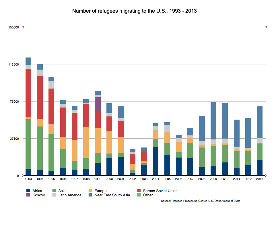
This chart shows the number of refugees arriving in the U.S. over time from specific regions. Created by Jenn Harris for the Reporting on Health Collaborative.
Partner With Us
 | Contact Information
© 2013 Radio Bilingüe, Inc. All rights reserved. Privacy Policy | Public Documents | Jobs


